
The past few weeks of business meetings and client product review and engagement, I realized something; most people just don’t really maximize their visual ID. When I talk about visual ID I am referring to your visual brand identity. This is what people see and associate with your brand; your logo, your brand colours, your typography on all communication, your social media posts tone and direction, your email signature, your business card design etc.
The brain who will help you develop this is normally a graphic designer. This is their area of speciality; once they fully understand your brand story which a branding specialist will develop for you, the graphic designer will be able to develop a clear brand guideline.
The whole purpose of a visual identity is several things, but I want to touch on just two:
Define your Brand
At the very beginning having a clear visual identity is about stating your claim in the market. You say, “this is my brand” and present it to the market in a compelling way. We live in the world that is more visual. You need people to see you as much as they should hear and engage with you. Let them see you the way YOU want them to see you. Think of your brand as the new kid in school, when you walk in with a new pressed uniform and polished shoes and well-spoken not everyone may like you, but they will recognize your existence.
Create a clear Brand Association
Consistency is all about repetition, you start to build an association when people see a consistent style of messaging from you, it could be the humour, seriousness, playfulness etc of your visual brand ID. Remember the articulate new school kid, after a month in school as long as she maintains that crisp look every morning and speaks unapologetically well, she may even be nicknamed (branded) a moniker associated with her look and demeanour.
Branding has an element of conditioning. You want to reinforce a certain type of emotion or reaction from people when they see your logo. This then defines how they engage with you. This is what is referred to as brand association. This association comes with time through constant consistent engagement with you.
Once you have these two elements on point, you are more likely to steadily grow your following.
Here’s what I need to remind you. In all your communication you need to respect your brand guideline. The brand guideline is more than a logo, typography and brand colours. A good brand guideline shows you how you should use those three tools across all forms of visual engagement from branded apparel like mugs and shirts, to logo placement on a billboard, a TV commercial, a social media post, a poster etc.
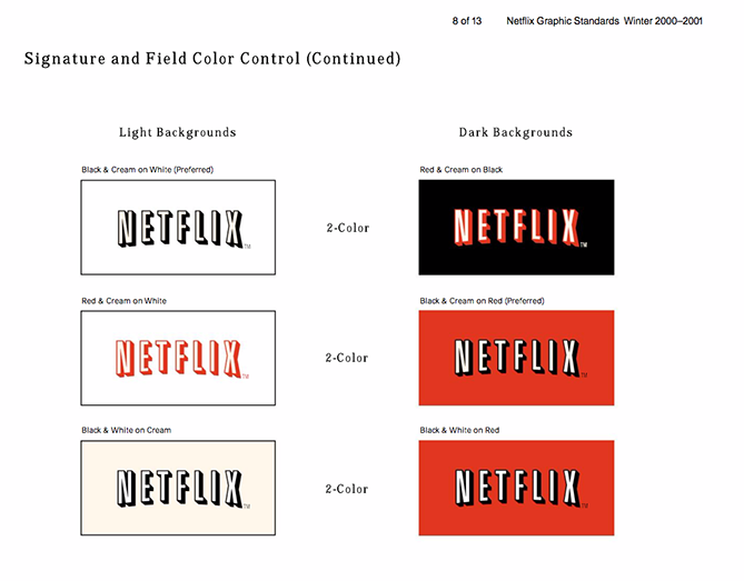
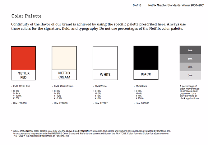
Here is an example of what I mean.
You can see more on this here.
A quick recap; as an organization or individual building a brand, first things first, ensure you establish a strong visual brand guideline for your brand, which will define who you are, what you are like and who you engage with, remember our school kid from earlier?
Second, ensure that this is present in all your communication;
Your email signature,
Your business cards,
Your website colours and font
Your social media posts
Your posters
Your banners etc
Third, factor in a good graphic designer as part of your business, because they are the ones who will develop the visual content for you. You will also need a copywriter to ensure the wording that goes out is aligned with your visual identity. Imagine that polished school kid sounding like an ogre, unfathomable isn’t it. The same applies if you are an exciting brand in terms of colour and logo type, people need to see the fun.
Imagine this…
![]()
Sounding like this…
But it really should sound like this…
Leave a Reply